

Top UI/UX Design Trends You Should Know in 2025
In 2025, the world of UI/UX design continues to grow and adapt with the latest technology and user needs. As more people use digital products every day, it’s important to stay updated with design trends that create smooth, engaging, and accessible experience.
Designers are now focusing on faster performance, clean layouts, personalized user journeys, and emotionally connected interfaces. Whether you're working on a mobile app, website, or SaaS product, following the latest trends can help you create better experiences that stand out.
1. Motion and Micro-Interactions
What is it?
Motion and micro-interactions are tiny animations or movements in an app or website that happen when a user does something — like clicking a button, scrolling, or swiping.
These small actions help users understand what’s happening and make the experience feel smooth and fun.
Why is it important?
They give feedback, guide users, and make the interface feel alive. For example, when you press a button and it slightly moves or changes color, it tells you that the action was accepted.
Example:
In a dating app, when you tap the heart icon to like someone, it quickly grows and then settles — this little "pop" animation confirms that your action worked.
More Examples:
In a dating app, when you tap the heart icon to like someone, it quickly grows and then settles — this little "pop" animation confirms that your action worked.
- A spinner that appears while a page is loading
- A swipe animation when you delete a message
- A shake animation when you enter the wrong password
Example: We will show here video animation just for 4-5 seconds

Tips:
- Keep the animations short and smooth (under 0.5 seconds)
- Use them to guide, not to distract
- Avoid too many flashy effects — they can slow things down or annoy users
2. AI-Powered Personalization
AI-powered personalization means that websites and apps use Artificial Intelligence to learn what you like and then change the content to match your interests. It makes the digital experience feel like it's designed just for you.
For example, if you often watch cooking videos on YouTube, the app will start showing you more cooking content. Or if you usually shop for sneakers online, the homepage may show sneaker deals first.
It’s like having a smart assistant inside the app that observes your actions and then rearranges things to help you faster.
Example: Spotify watches what songs you listen to the most and creates personal playlists like “Discover Weekly” or “Your Daily Mix.” These playlists are different for every user, based on their taste.
Tip for designer and developer:
You can use tools like Google Analytics, Hotjar, or built-in tracking to understand what users click on, what they ignore, or how long they stay.
Then, use that data to change the design — like showing favorite categories first, offering product suggestions, or even switching to dark mode if a user prefers it.
3. Dark Mode as a Default Option
Dark mode is a color theme where the background is dark (usually black or dark gray) and the text is light (usually white or light gray). This style is becoming more popular in 2025 for a few good reasons:
- It’s easier on the eyes, especially in low-light conditions like at night.
- It helps save battery, especially on phones with OLED screens, where dark pixels use less power.
- Many users prefer it, because it feels modern and reduces screen glare
Example:
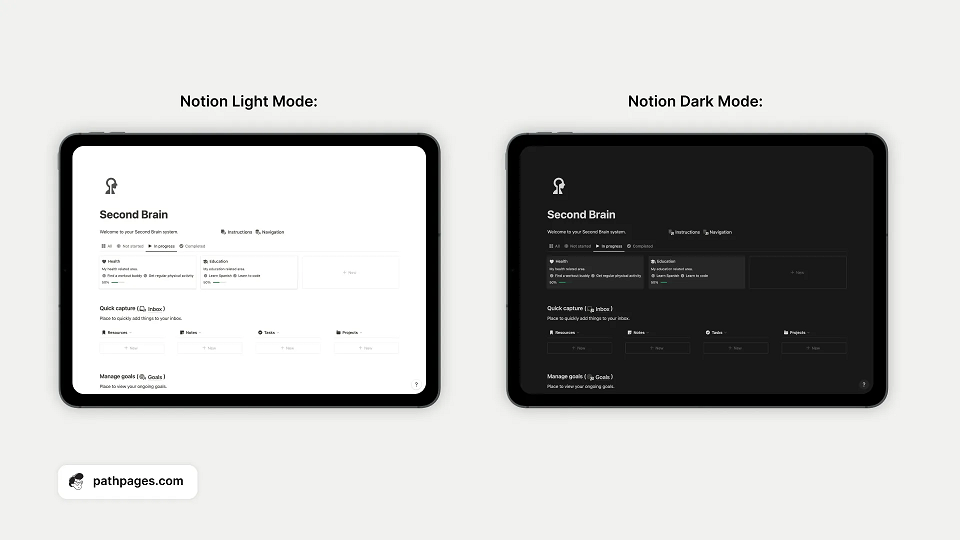
Apps like Notion and Slack allow you to switch to dark mode. In fact, many people use these apps in dark mode all the time because it looks cleaner and is more comfortable.
Tip:
When designing an app or website, always create both light and dark versions. This gives users a choice and ensures your design works well in any setting. It also makes your product more accessible to people with vision sensitivity.
4. 3D & Immersive Design
In 2025, more apps and websites are using 3D visuals to make the user experience more realistic and engaging. Instead of flat images, users can now see things from different angles—almost like touching or moving them in real life.
What does it mean:
3D design means adding depth to the visuals. It can include spinning models, pop-up objects, or layered designs that feel like they are coming out of the screen. This makes the interface feel more fun, interactive, and modern.
Then, use that data to change the design — like showing favorite categories first, offering product suggestions, or even switching to dark mode if a user prefers it.
Example:
Think of an online shoe store. Instead of just seeing one photo of a shoe, you can rotate the shoe in 3D, zoom in to see the texture, and even see how it looks on a virtual foot. This helps buyers feel more confident before placing an order.
Why it’s useful:
- Helps users understand the product better
- Creates a "wow" factor and improves engagement
- Makes the app or site feel more advanced
Tips:
3D elements can slow down the website or app if not handled well. So, only use 3D where it helps the user (like product previews or tutorials) and make sure the design still loads quickly on phones or slow internet.
5. Voice and Gesture Interfaces
In 2025, many apps and devices are using voice commands (talking) and gesture controls (hand movements) instead of only touch or typing. This means users can speak or move their hands to use an app, making the experience faster and more natural—especially when your hands are busy or you can’t look at a screen.
Example:
- When using Google Home, you can just say “Turn off the lights,” and it will do it for you—no buttons needed
- Some fitness apps let you swipe your hand in front of your phone’s camera to change workout steps without touching the screen
Why It's Useful:
- Great for multitasking (like cooking and changing music)
- Helpful for elderly or differently-abled users who find tapping hard
- Feels more modern and hands-free
Tips for Designers:
- Keep voice commands short and easy to remember (like “Play music” or “Open calendar”)
- Always give clear instructions or feedback (like “Sorry, I didn’t get that”)
- Include a touch or button backup in case the voice or gesture doesn't work
6. Minimal & Clean Layouts
What is a Minimal & Clean Layout?
A minimal layout means your design only includes the most important elements — nothing extra. It’s not about having less design, it’s about designing only what’s needed for the user to complete a task easily.
A clean layout is neat, well-organized, and not crowded. It uses lots of white space (empty space) so the content is easier to read and understand. Users don’t feel overwhelmed — they know exactly where to look and what to do.
Why It’s Important:
- People have short attention spans
- A busy or messy design confuses users
- Clean design helps users find things quickly and take action easily
- It looks modern and professional
Real-Life Example:
Think about Apple’s website.
It shows one product at a time with big, clear images, simple text, and lots of space around. You don’t see too many buttons, ads, or links all at once — just what’s needed.
Health apps do the same — they often show your daily step count in large font with simple icons and a clean background.
Simple Tips:
- Focus on one goal per screen
- Use fewer colors and fonts
- Keep buttons and text clear and big enough
- Add space between elements so the layout “breathes”
- Remove anything that doesn’t help the user (extra images, unnecessary links, too much text)
7. Data Visualization with Emotion
This trend is about showing numbers and reports in a friendly and emotional way, not just in a boring table or plain text.
Instead of giving users only raw data, we add visual elements that help them:
- Understand quickly
- Feel something — happy, proud, motivated, or even alert
What it means?
Designers now use colors, icons, emojis, and short messages to make data more fun and meaningful.
Example:
In a fitness app, if you reach your daily step goal:
- You see a green progress circle
- A smiley emoji appears
- And a message says: “Great job! You hit 10,000 steps!”
This makes users feel good and want to keep going.
Tip:
- Use green for success, red for warning
- Add simple icons (like 🔥 for calories burned or ❤️ for heart rate)
- Keep data short and visual, not heavy with numbers
8. Accessibility-First Design – Explained Simply
This means designing apps and websites so everyone can use them easily—including people with disabilities like low vision, hearing loss, or limited hand movement.
Accessibility helps:
- People who can’t see well (need bigger text or screen readers)
- People who can’t hear (need captions for videos)
- People who use a keyboard instead of a mouse
- Older users who may find small buttons or low contrast hard to read
Example:
- Letting users increase font size
- Adding alt text for images (so screen readers can describe them)
- Using high-contrast colors so text is easy to read
- Ensuring all buttons are large enough to tap
This makes users feel good and want to keep going.
Tip:
Follow official rules like WCAG (Web Content Accessibility Guidelines). Also, test your designs with real users, especially those with different needs, to make sure everything works for everyone.
Conclusion
UI/UX design in 2025 is all about creating digital experiences that are simple, smart, and user-friendly. The goal is to make apps and websites that people enjoy using—and that work well for everyone.
From clean layouts and smooth animations to AI personalization and voice control, every trend is focused on making life easier for the user. Adding emotional touches like icons or colors, and designing for all users (including those with disabilities), helps build a deeper connection and better experience.
As a designer or product creator, following these trends can help you stay ahead, build trust, and deliver designs that people truly love to use.
- Keep it simple
- Think about the user
- Test often
- Design for everyone
Interested in learning more about x-enabler?
Leave a comment!